Dashboards & Data visualisation
Building a digital way to visualize your goals and data? Step one: make it understandable and accessible. At SQLI we offer you our service for data visualization. No more losing time by plodding through the analytics!
Together with our performance team you can track how well your marketing strategies work and make adaptations afterwards. Want to know where you need to optimize? We’d love to help out!
Why data visualization and what is a dashboard?
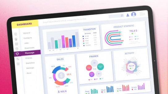
With data visualization you represent your data via graphs and tables to get insights into your business on operational and strategic KPIs. A (web analytics) dashboard aggregates and visualizes the most relevant data to give an overview and keeps track on how some indicators have performed over time. A good example of such a tool is Lookerstudio. A well-designed dashboard can assist you to understand what is going well and what should get more attention in your company.

Marketing vs Business data
A dashboard is built on your operational and/or strategic data, directly on your operational system, your data warehouse or a combination of both. The data of your business can be SAP: ECC, S4HANA, C4C, Hybris, Commerce... If you have marketing data you will most likely work with Lookerstudio, Odoo, Microsoft Dynamics, Dataverse, X, Meta... Marketing data is just one dashboard for web, e-Commerce, social traffic and ROI’s. Because we’re talking about big data dashboarding is used in a wide range of domains.
Data is the new oil.
The information that matters
Would you love a simplified version of your analytics so you can cut down the time spent on organizing it and spend more time to actually look at it? You’re at the right address! SQLI works with several data visualization tools to provide you with the information that matters.