


“Mobile First. Filter Friendly. Context Counts.” - Why Better UX Drives Better Conversion
Imagine browsing an online store on your phone. You know what you want. You tap the search icon, type in your query—and you’re met with cluttered results, confusing filters, and buttons too small to click. Frustrating? You’re not alone.
Mobile has officially overtaken desktop. In March 2025, mobile devices accounted for 58.4% of all e-commerce sales in Europe (IRP Commerce). In the Netherlands, smartphones made up a staggering 78% of retail site visits (Statista).
And yet, despite that dominance, mobile conversion rates still trail behind—hovering between just 1% and 3%, depending on the industry (OptinMonster).
It’s not the traffic that’s the issue. It’s the experience.

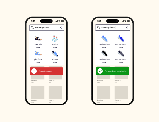
Personalizing Search: Why Context Matters
A sub-par user experience can have many causes:
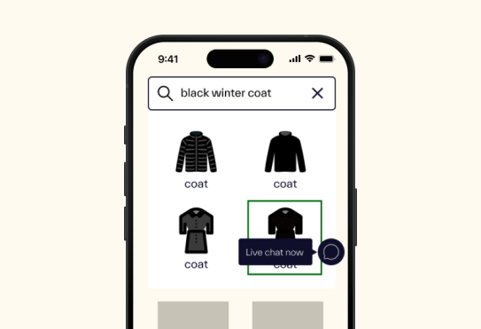
slow or unresponsive search results, no autocomplete, a poorly placed search bar, or confusing search and filter behaviour.
The first step for improvement will be to truly understand your customers in order to tailor the search solution to them. A good starting point would be to use analytics to continuously monitor the usage of the existing search solution.
Finally, the mobile search experience should not be forgotten:
design search interfaces to fit mobile screens, ensure text and buttons are large enough to tap comfortably, and avoid clutter to keep the customer focused on what the actual goal is—finding the right product.
“Wrong personalization frustrates users—so always use testing and analytics.”
Users don’t need to be tracked with personal data. But they do expect search to adapt to their behavior. When it doesn’t, bounce rates spike.
We have implemented Search for
Filters That Guide - Not Confuse
Ever tried to filter results and felt like you were doing detective work?
That’s exactly what happens when filters, categories, and suggestions blur into each other. Users are left guessing what does what—and give up.
The fix isn’t flashy. It’s thoughtful design. Use behavioral data to highlight the most-used filters, remove the unused ones, and always include a reset option. It sounds simple, but few get it right.
We worked with a client who restructured their filter logic by syncing product attributes to a smart search engine. After reordering filters based on real usage patterns, users were able to navigate results more confidently and complete purchases faster.
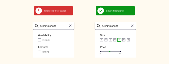
“Show the most useful filters first, add tooltips, and always have a 'reset filters' button.”
Small changes. Big difference.
Mobile Optimization: Tap Targets, Speed, Simplicity
Search on mobile shouldn’t feel like a challenge. Yet often, it does.
Tap targets are too small. Load times are too slow. Interfaces are packed with options better suited for a desktop screen. It’s no surprise mobile conversions lag behind.
“Keep it clean. Large buttons, fast search, minimal clutter.”
As one of our experts put it: “If mobile lags behind desktop, you’ve got issues to fix.”
It’s not just about how search looks—it’s about how it performs. Track where users drop off. See what gets tapped, what gets ignored, and what gets added to cart. Then adjust.
Think of it this way: if your mobile search doesn’t work with a thumb, it doesn’t work.
What You Actually Need
The solution isn’t complex. It’s practical:
- Search that’s responsive to device and behavior
- Filters that support decision-making, not sabotage it
- Results that feel relevant—even without personal data
“Search UX isn’t just a feature—it’s the moment of truth.”
