
Sights on Sites
In Part Two of the Redbox series on web design, we discover the sites that currently make up the favourites list of Redbox Creative Partner Paul Lewis. Read Part One here.
When it comes to web design, Redbox's creative partner, Paul Lewis is clear about what he likes.
“Make it look good and easy to shop,” he relays.
After 23 years in the ecommerce industry and many more in retail, he is the creative mind behind some of the most recognisable digital stores in the UK and beyond.
From Lulu Guinness, Faber & Faber and Heal’s, to Cath Kidston and Ottolenghi, he has learnt the art of capturing a brand’s unique DNA while ensuring the customer journey remains intrinsic to the design.
But Paul believes many brands are still getting it wrong.
“If you go to a good restaurant, you don’t want to search for someone in order to get your wine glass refilled,” he says. You want someone to notice that your wine glass is empty. It’s good service.
“The same applies to websites. Good service equals presenting the right content, in the right place at right time of the user’s journey.
“We understand how to help brands offer this good service so their customers don’t need to go through a lot of unnecessary effort to shop or buy what they want to.
“But it’s more than this. It’s getting the right balance. It’s not good enough to be quick. It’s got to be stylish and interesting visually, too. That’s my sweet spot. Making it look good and making it easy to shop.”
But what websites and ecommerce platforms does Paul enjoy using when he takes his work hat off? Here, in no particular order, he takes us through some of his favourites.
Redbox's creative partner, Paul Lewis
Bring a Trailer
An auction site for classic, collector and enthusiast vehicle purchases and sales. The site’s staff curate vehicles submitted, giving owners the opportunity to tell the story of their car’s history in a creative, stylish and unique way.
Paul says: “Bring a Trailer is an auction site that started in the States, featuring cars as though they were in GQ magazine.
“The photos are beautiful, the stories are personalised and they talk about the people, the cars and the history around them, in a really nice way. I like the writing style too. It all adds real value for its readers and customers.
“They curate it, so you know that if it’s on the site they have been looked over properly. Everyone who makes it on gets a platform to show their car in detail.
“They have turned their site into a beautiful brochure. It’s revolutionised the car market as far as I’m concerned.
“I’m a vintage car owner and I love that you can search for your make and model and see the market for that car. A bit like stocks and shares, you can see if there’s an upward trend.”
Bon Appetit
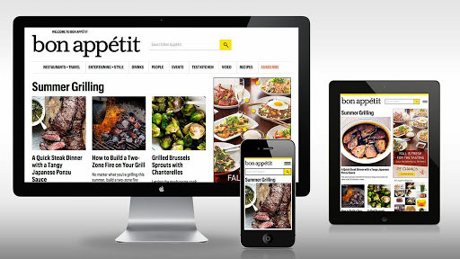
A one-stop hub of everything to do with food. From great recipes and interesting features, to restaurant reviews and food tips, the site has it all and packaged up in a stylish way.
Paul says: “I enjoy cooking, I do it a lot. I spend a lot of time on Bon Appetit – it’s what I call food porn!
“I find it a nice attractive site that shows food in a stylish way. It has a clean look, is easy to navigate and it’s very pleasant to browse and nice to use.
“We all eat more at home now. Everyone’s doing food blogs. But this feels like the entire world of cooking in one place – non-stop content on food. It’s growing and growing and a real cookery publisher now.”
New York Times
The online arm of one of the most respected and well-recognised news publishers in the world.
“It’s really well laid out for a start,” says Paul. “I like the design and it’s a lesson in how to organise content and how customers or readers like to navigate it.
“The paper is always trying to provide in-depth news in a way that’s easy to digest. There’s so much content, but it’s a great example of how to set it out and I think a lot of ecommerce sites could learn from them as it’s not easy to do.
“They manage to create a strong, visual hierarchy and the sections are well thought out. They’ve taken all the skill that’s gone into newspaper design and taken it into websites.”
Cup of Couple
Photos, quotes, recommendations for travel and fashion, Cup of Couple aims to give you your daily dose of inspiration.

“I like the site from a pure design point of view,” says Paul. “It is an attractive site, with a nice layout and stylish fonts. It mixes beautiful lifestyle content and design and has a luxury vibe that I’m drawn to.
“It’s an interesting concept for a website, promoting interesting photos and concepts to inspire creatives and other people.
“It looks different from other sites without being too far out there. It’s a fresh-looking approach to graphic design.”
Zara Home
The online arm of the retail store, the platform sells stylish homeware and now has sections for pets, recipes and more as they up their content.
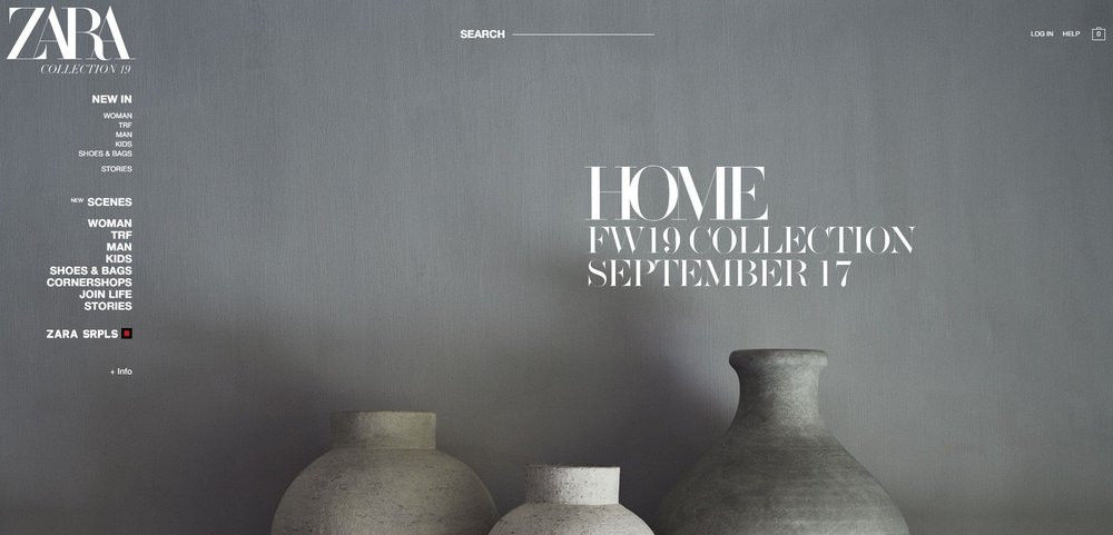
Paul says: “I like the graphic design and the fact that they use images well and the site feels uncluttered and is easy to navigate.
“It’s a nice shop window for the brand and I like the richness of its presentation.
“Too many retail outlets want to put too much on their home pages and it can put customers off. They aren’t inviting you in.
“But Zara gets the balance right.”
The Guardian and Tortoise Media
The Guardian is one of the oldest newspapers in the UK, starting life as the Manchester Guardian back in 1821. Its online arm is one of the most read digital news sites in the UK, with a mix of news, features, sport, recipes and more. Tortoise Media hasn’t been around for long, but aims to change the way we consume news. With more in-depth articles, the media group doesn’t chase the news for clicks or headlines.
“I’ve put these two together, because although there’s not much ground-breaking here, I like them both,” says Paul.
“They are both curating the news in different ways, but I like how they are put together.
“For people who want longer, more informed reads about interesting topics, Tortoise is a fairly new concept. But it has organised its content in a user-friendly and stylish way that makes you want to read. It’s simple, but attractive and it pulls you in. They also have an interactive element of themed webinars to involve the readers fully.
“The Guardian is similar to the New York Times, in that it takes tonnes of content and organises it brilliantly. It’s easy to navigate and find what you want without being too cluttered. It’s amazing really, considering how much content is on there and is put on there every day.”
Good Moods
An inspirational, digital magazine and creative agency, the site brings together the latest trends and inspiration for a creative audience of decorators, designers, artists and influencers.
Paul says: “This for me is visual eye candy. I like that you get to see into the minds and worlds of so many creative people.
“I like the way the site is laid out. It’s simple, but they use the images really well, with nice blocks of colour.
“It’s always good to see what they are doing and who they are featuring – I find it very inspiring.”
Charles Tyrwhitt
A menswear retailer with timeless style and British elegance, the online store sells shirts, shoes, suits, jumpers and more.
“This is one of my favourite sites that I have been involved in designing,” says Paul.
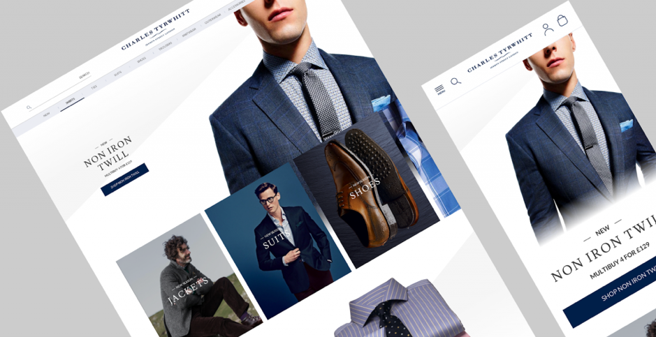
“We took a business that was going in one direction and gave it a new lease of life.
“We designed a user journey that almost gamified the idea of better value. If you buy one shirt, it reminds you that if you buy three more you get a discount, but it does it subtly. The idea is that instead of shouting about it all over the place, it builds it into the customer journey.
“I really like the look of the site, it’s stylish, with good navigation. We are hopefully doing more with them in future. It’s one I’m really proud of.”