
How has UX changed?
In the world of online shopping the UX goal is very clear: to help the user find a product and buy it as simply and as quickly as possible.
In other words it’s about the overall user experience and whether the site is a joy to use. If the experience is no good, cumbersome or irritating, people will simply leave, which will cost your business customers.
To achieve a high-quality user experience, there must be a seamless merging of multiple disciplines - marketing, engineering and UI design.
Here, we take a look at some of the current trends that, if elegantly incorporated across your site, will increase consumer feel-good factor and engagement with your brand.
Getting the basics right
It always helps, before starting any retail UX project, to take a step back and make sure you understand the desire driving the purchase. It’s about getting inside the consumers head, and being sensitive to how your work will make them feel. Good feeling drives engagement.
If their behaviour is being driven by need or convenience, as it usually is with food shopping, then using saved lists, competitor price comparisons and delivery time-slots will be valuable features.
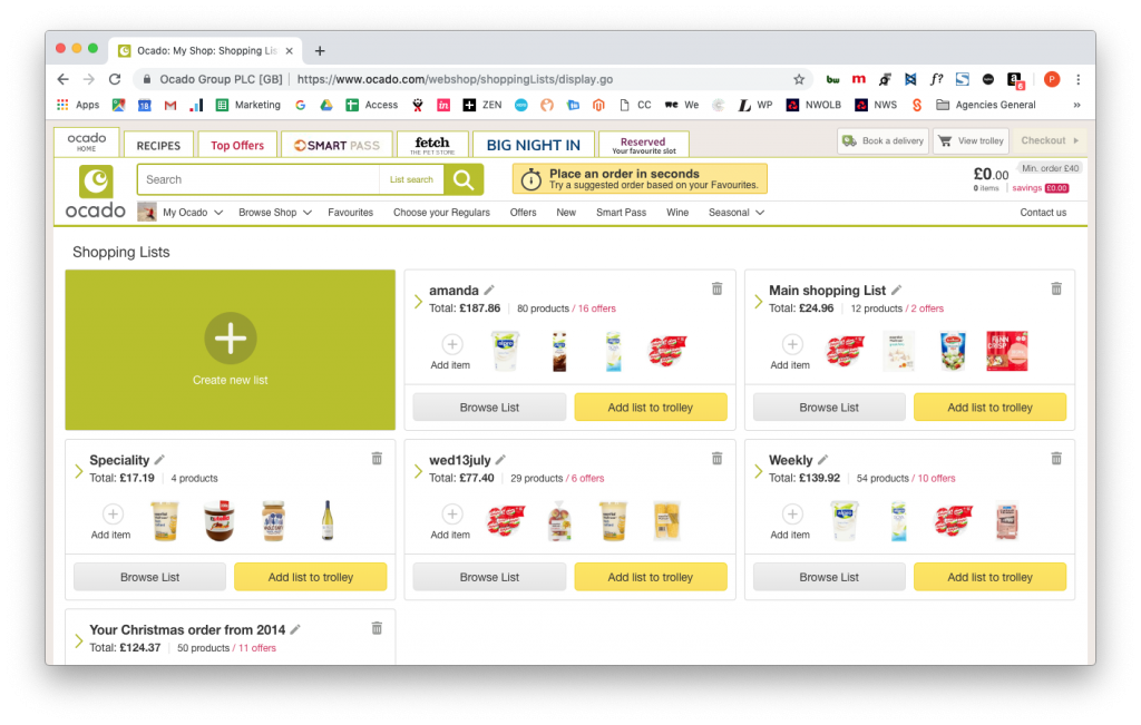
Ocado: Highly developed shopping list functionality offer increased convenience.
In fashion, luxury and lifestyle retail, a prevalence of beautiful product images and colour will create a heightened effect on the senses and increase desire.
Essentially, the look and feel of the site needs to reflect the best expectations the consumers have in their minds for the sector they are shopping in. Good UX works hand-in-glove with the right look and feel to improve the functional usability of the site.
Although we have to care deeply about how the “machine” works, at the end of the day you can’t really separate good UX from good design, look and feel. They both need to work together as one.
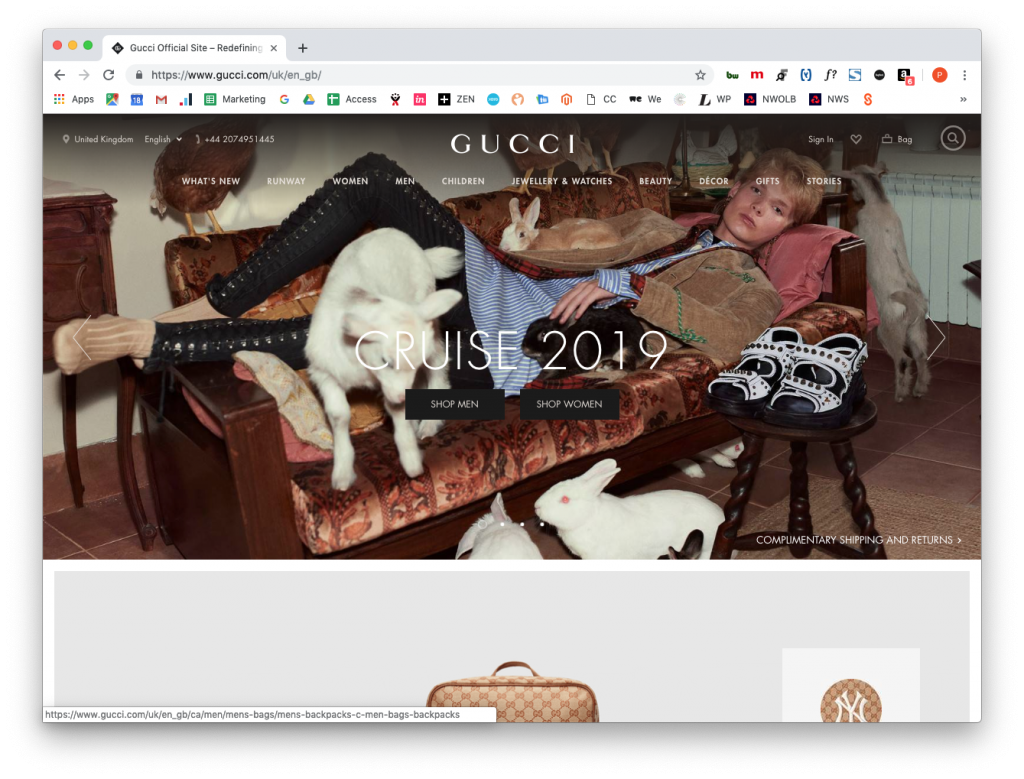
GUCCI: Powerful and stylish imagery take centre stage and even navigation has to float over it rather than have its own separate and defined space.
The basic shopping need is summarised as: “help me find a product and help me buy it easily”. It is still the number one purpose of an ecommerce site. The nuts and bolts being: create good navigation, use good images and make sure the checkout works easily and feels safe.
If the user is uncertain about what the site is or loses orientation within the shopping journey, it’s unlikely they’ll stay too long and bounce rate will go up. In some ways it's similar to walking into an unknown part of town, losing your sense of direction and then starting to feel anxious. Anxiety leads to the exit.
The way to resolve these orientation issues are well known - make sure there is good signage. A Marks & Spencer bricks and mortar store is a great example of this in action. The windows are used to attract you and tell you what you can find inside the store ( you can of course look through the store windows - they don’t completely block out the shop floor). But as soon as you enter the store you will see that the eyelines of signage have been carefully designed to enable you, with one glance, understand where each department is, where the cash tills are and if you need to go up or down to find products. Knowing this allows the consumer to feel in control and confident that they know where they are going. Confidence helps conversion.
They need to feel the same when landing on your website. Confidence is created through good navigation, clear on-site sign-posting, sensible use of breadcrumbs, clear call to action, uniform global elements, consistent action states and hierarchies of information.
A note of caution, beware of trying unusual design ideas out like putting the standard left hand page navigation on the right side - as Selfridges once tried. They thought because the Selfridges brand celebrates difference and standing out from the crowd, it would benefit by applying this thinking to UX. Wrong. Conversions plummeted as users looked to the left for navigation and didn’t find it there. Style and UX are not the same.
So what are the new trends in UX?
Mobile-first
Mobile-first design isn’t a new trend but it is still the single most important change in user experience since the early days of the web. Mobile responsive design has irrevocably altered the nature of UX. Where we used to consider desktop screens, mouse controllers and keyboards, we now have to include different sized screens on a multitude of different devices, as well as the UX of touch gestures.
This has resulted in designers thinking about web design as being fluid and not fixed. The new boundaries that limit screen design being the dimensions of the actual device itself.
The website Statisa.com shows that the percentage of all global web pages served to mobile devices has grown from .7% in 2009 to 52.2% in 2018. In 2021, 72.9 percent of all retail e-commerce is expected to be generated via mcommerce, up from 58.9 percent in 2017.
Social proof
Consumers value the opinion of others. Nielson research shows 92% of people will trust a recommendation from a peer and 70% of people will trust a recommendation from someone they don’t even know. Make sure social proof messages are threaded throughout your site. This means placing reviews, testimonials, instagram posts, experts and facebook friends through out the shopping journey.
Personalised ecommerce and AI
The power of intelligent personalised recommendations based on solid analysis of consumer preference data has led to ongoing growth in companies such as Amazon, Google, Spotify and Netflix. Spotify’s new music recommendations are a good example of this in action, which has increased user interactions from 37% of monthly users to 44% of monthly users.
It is now possible to incorporate intelligent personalisation engines into standard ecommerce websites. Services such as Nosto integrate easily into Magento and facilitate more relevant and personalised products to be presented to the user as they navigate your site.
Data-driven user testing
Another consideration that needs to be taken into account today is the ongoing growth of data derived insights in the online design process. This requires a more egoless approach to design than many designers feel comfortable with. It was well-known that Steve Jobs didn’t embrace “design by committee” in favour of inspiration from talented people he admired. But it is obvious that analysis of mass user movement and actions can only benefit the UX designer.
A good approach is to test little and often during the design process so that small incremental improvements are made as the process goes along, rather than larger changes further apart.
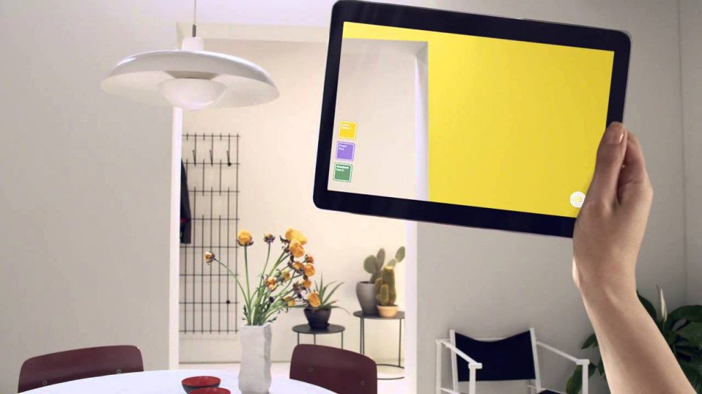
Augmented Reality
Until recently considered more of a gimmick, Augmented Reality is becoming more and more commonplace in ecommerce UX. Techcrunch reported that when HOUZZ introduced Apples ARKit into its app (which allows users to layer 3d objects onto the photo screen) users were “11 times more likely to purchase and spent 2.7 times more on the app”. Here are some great examples:
Dulux Visualiser
Dulux has created an app Dulux Visualiser, which allows the user to preview any paint colour on their own walls using their mobile phone. While not perfect, it is surprisingly good at giving you an idea of what your room would look like when painted.
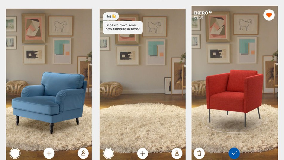
Ikea Place
Ikea’s app, Ikea Place, can drop images of products onto the photo screen of your mobile and they behave as if they were really there. As the veracity of the examples improves, these types of apps will become more and more realistic and usable. They are already highly engaging.
Vivinio
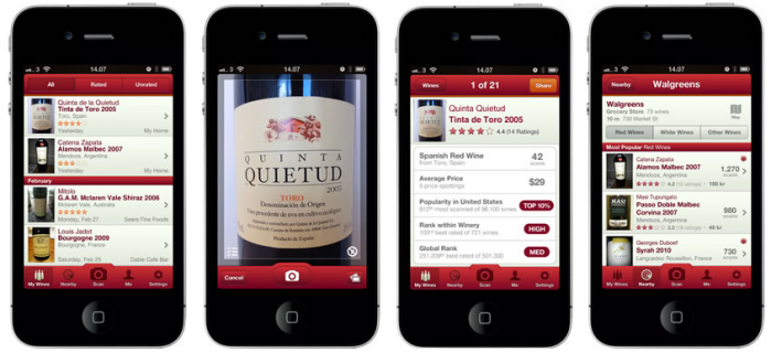
The Vivinio app enables the user to photograph a bottle of wine, which the app then finds along with reviews and the best price to purchase. It’s a very useful tool for those that can never remember the name of a good tipple they had!
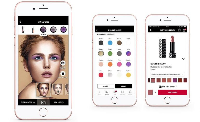
Sephora
Sephora Virtual Artist is an app that lets users try on different make-up products with a mobile visualiser. Sephora is one of the most forward looking ecommerce businesses and it places a high value on overall consumer engagement. This app only increases levels of interaction.
Conversational commerce
Conversational commerce is the next evolution in digital engagement. It brings together messaging such as chatbots and live chat into the online shopping experience so customers can get immediate response to questions or concerns, just as they do in-store.
The time is now
As technology develops and becomes more accessible and practical, we’ll see more examples and use cases emerging. Those organisations who are willing to embrace new trends and technologies to provide customers with a new, enriched online experience will ultimately win.
There has never been a more exciting time in ecommerce and UX design. User experience design - one that is relentlessly focused on providing a superior customer experience, is critical to any successful ecommerce strategy.
If consumers can travel through a website with ease, seeing only your brand, products and the benefits of ownership, then you know that the UX has succeeded.
Paul Lewis is creative director at Redbox Digital. You can drop him an email at [email protected].