The 3 pillars of a Design System, the holy grail of every digital product
There’s no doubt, Design System is the expression on everyone’s lips right now. For some it’s a library of components, for others it's a style guide, or even a website…
For many more still, it’s a total mystery! Nobody designing digital products can do without this kind of approach if they want to compete with their rivals.
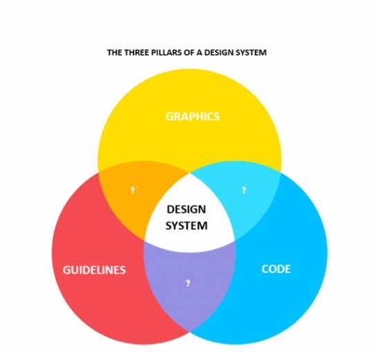
Venn diagram to the rescue!
What better than a Venn diagram to illustrate three major interconnected principles. It makes things easier to understand, and if we manage to attribute a tangible role to the ties that bind them, our evangelisation work is done. There’s sometimes a touch of post-purchase rationalisation visible in Venn diagrams. After all, a Venn diagram without any post-purchase rationalisation at all is verging on boring!

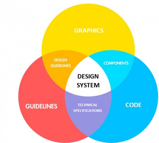
The three major disciplines involved in a Design System. We’ll see the ties that bind them a little later.
Pillar 1: graphical hardware
This is the easiest part to understand. Like in any style guide, we describe the visual form that the components will have. In addition to components (described in detail below), we include the ranges of colours and typographies to be used, but also iconographical resources and a library of visuals, if any.
Pillar 2: code
In order to accelerate development and production, reusing code is key. So a code library must be included in a Design System for it to be effective. Depending on the structure of the technical platform, it may at least include HTML and CSS code. It can also include page templates, JavaScript, particularly React or Angular components, etc. The only prerequisite is for it to enable the development of all the media needed for the product and its versions.
Pillar 3: guidelines
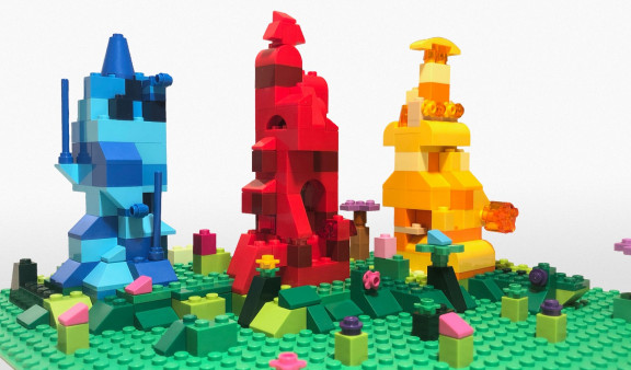
This is certainly the pillar that makes a Design System really worthwhile! Like with LEGO, you need a building plan that gives you all the keys to designing an interface that will meet user needs, reflect brand values, and comply with good design practice. Guidelines can also go beyond a simple building plan. They could also include:
- Design guidelines (described in detail below)
- Brand values
- Good UX design practice
- Social media, and more generally communications guidelines
- Editorial guide (or tone of voice)
- Iconographical guidelines (what type of visual for what message)
So what are the ties between these 3 pillars?

In addition to being highly educational, you’ve got to admit that a Venn diagram always has quite an impact during a presentation!
Graphics + code = components
One definition of a component is “A building block of a more complex whole, which is an assembly of often different components”. Applied to our Design System, a component is any reusable graphical component that can be integrated into a graphical interface. The organisation and ranking of components is often inspired by the atomic design method developed by the web design master Brad Frost. But some prefer choosing models more closely connected to their business line and categorising components according to their use rather than their form. With this way of organising components, we can easily imagine that it will be easy to integrate an HTML/CSS version of each of these components. This is even truer with the growth in use of component-based libraries such as React or Angular.
Graphics + guidelines = design guidelines
This part focuses on visual design instructions. Issues addressed include using a colour in a given context, typographical use rules, instructions for the creation of new components, and use of grid lines. In short, anything visual-related but not “visible”.
Guidelines + code = technical specifications
Like design guidelines, technical specifications describe everything that has to be arranged “around” the code. Development, test and production environments, accessibility standards, coding conventions, data models, etc. There’s really no limit. The aim is for absolutely any developer to be operational after studying these specifications, and for any coder to be able to work on someone else’s code without tearing their hair out!
The invisible pillar (or “the divine“): THE HUMAN ELEMENT
This is present in each of the three other pillars and is even more key because a Design System involves a high number of business lines (design, technical, communications, branding, etc.), which are often divided into clearly-distinct units and sometimes could be shared better. A Design System can only be a success if all these business lines work together and follow instructions. Before even starting a Design System, you have to make sure that all the stakeholders have fully understood the point and challenges of this kind of approach. And to do that, you have to COMMUNICATE!
In conclusion…
This way of presenting a Design System is a good initial approach for anyone who’s a stranger to this concept. There are many ways of organising a Design System; first and foremost, it has to be organised in the interests of the project. The aim of the game is to save time during production!