
How a one-of-a-kind partnership resulted in a new visual identity for SQLI Digital Experience
When it comes to revamping its own brand and design, what does an agency known for altering the digital experiences of some of the world's top brands do? It works with some of the most talented designers in the industry.
Redbox Digital joined the SQLI Group almost two years ago, forming a formidable digital collaboration. They weren't on their own. Big hitters across Europe, such as Osudio, Star Republic, and Wax International — each with significant digital experience and varied strengths and specialties in the sector – have been doing the same for several years.
SQLI was able to assemble a formidable creative team from some of the newest agencies to join the group, lead by marketing and communications director Christine Julien, when it came to revamping its own brand and identity.
Blandine Pietra, who was SQLI’s creative lead on the project, said: “Instead of choosing an outside agency, we wanted to involve some of our subsidiaries and make it collaborative. We have some amazing talent and experience across the group, so agreed it would be exciting to have the creative directors from each brand, work together.
“In the same way these agencies have joined SQLI to combine their skillsets and work on major digital projects together, we wanted to do the same with our own project.
“It was important to have a new identity that could bring everyone together: to merge us as one and allow us to carry the same flag and have the same DNA, as we moved into the future.”
In January 2021, a formidable creative team was assembled including, Paul Lewis, creative director from Redbox Digital, with main offices in the UK and the Middle East; Eline Cottyn, creative director from Belgium agency Wax International; Daniel Georgsson, design director, from Swedish agency Star Republic; and Daria Pernak, from Osudio, based predominately in Germany and Holland.
Blandine continued: “Everyone had tasks relevant to their skillset and experience. Paul managed the storytelling side; Daria and I managed graphic elements like the colour pallet; Daniel managed the typography; Eline managed the animation and video. I also managed the process and brought it all together.
“It was great for us to work together like this. As a designer, working with all these specialists with different ideas and ways of operating, was really interesting. It motivates you.”
The new name SQLI Digital Experience was chosen, preserving SQLI but adding a new element that encapsulated the brand's essence and direction. From there, it was a matter of developing designs, language, color schemes, video and animation, and typography that could be used across the group's online and offline branding and publications.
Blandine said: “We worked closely together for three months. The first one was an icebreaker as we didn’t know each other, but after that we worked separately on mood boards, picking words and visuals that inspired us and worked on the colour palettes and other design elements, presenting our ideas to each other each time.
“We focused on words that brought about a ‘human’ side. ‘Digital’ can be a cold word, but we wanted to tell a story that explored values like humanity and looked at the relationships, the people and vibrancy of the group.
“From here, we agreed on areas that we thought interesting to continue to work on and go away and work on these areas further.
“My part was the graphic element and colour palettes as I like to experiment with colour and design. I worked closely with Daria in Amsterdam.
“Paul is good at storytelling and so he came up with the acronym for the story behind SQLI - based on latin words: Senti (to experience); Quaesti (to question); Labora (to immerse and analyse and Inspira (to inspire).
“Bit by bit, it all came together.”
Surprisingly, for a team with such diverse backgrounds, agreeing on design elements was not too difficult.
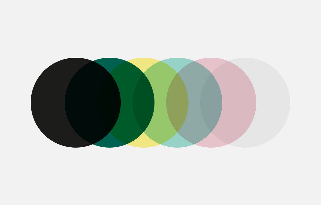
Blandine continued: “We pretty much agreed on everything. It was a really collaborative experience. The only area that was a challenge was in the colours. It tended to be the male members wanting minimal colours, greys, blacks and pastels, with the female designers preferring bright, pop colours.
“In the end we decided to go for a more minimalist feel - using minimal splashes of colour on the website and for presentations and documents, but bright, bold colours on social media – we felt we needed a design that captured attention, particularly on our social channels.”
The designers presented their final conclusions to the group's directors in a presentation.
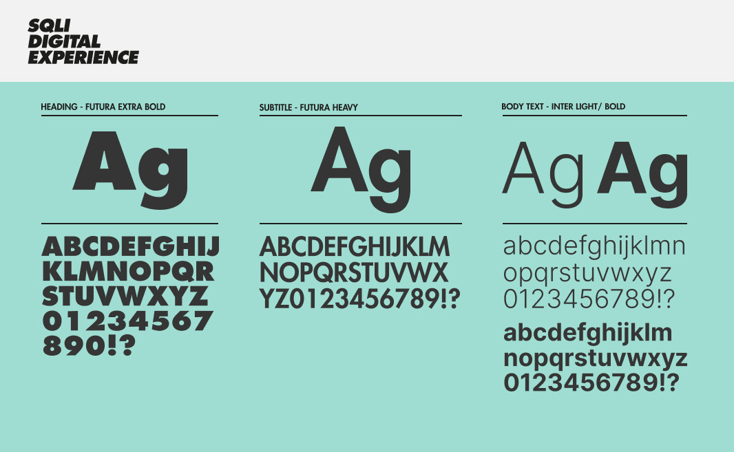
SQLI made the first steps toward incorporating the new design into normal use earlier this year, after everything was signed off. New standards have been established for how to utilize the new logo, which font should be used when and when not to use particular colors and combinations, and how to make the most use of pictures. The new style guide covers email signatures, white papers, videos, and PowerPoint presentations.
Before the branding and design are carried out to the rest of the group, the corporation is promoting the brand ID on social media.
Despite working remotely and with so many offices participating during the lockdown, the project proved to be a great experience, paving the door for future cooperation.
Blandine added: “It was less intimidating and easy to work together remotely. Sometimes I would be connected to my team and we would create something live together and it was a really easy and fast process to work like this.
“The whole project was really successful. We didn’t know each other at the beginning, but now know each other really well, our strengths and weakness, even.
“We have created something we can be proud of, that unites the group and that can and will be adapted as we grow.
“This is our first collaboration, but it has set the foundation for working closely again as we continue to evolve.”