
Design team takeaways from Adobe Max 2021
If you're a designer the words "Adobe MAX" are going to make you perk your ears. It's the design equivalent of Apple's yearly keynote or Paris Fashion Week. Since a couple of year's it's completely free and available online, which means our design team at SQLI took a couple of hours last week to immerse themselves in the newest design trends, cool new developments in the Adobe apps and general design geekery.
Expanding Illustrator
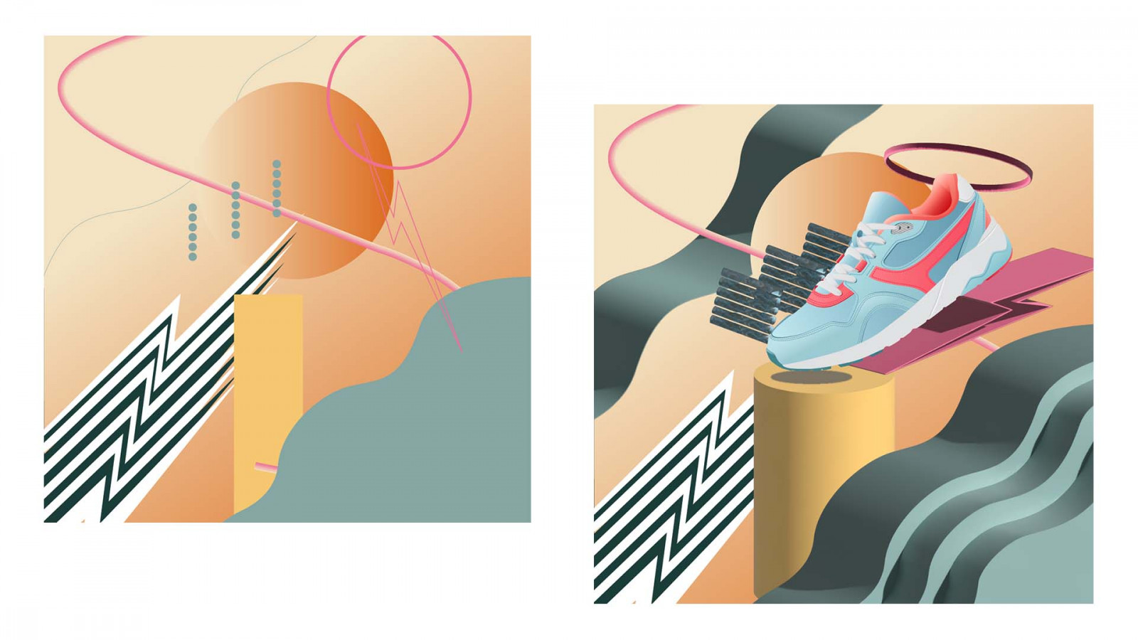
To be honest I wasn’t thinking about writing about Illustrator. It’s not my favourite software. I’m more an After Effects kind of guy. But when I saw the in-depth presentation of Illustrator's new features I thought: “Well those new 3D tools look shiny and new!” And like a kid in a toy store I started playing with everything. And wow, did I have fun. You have to know, Illustrator already had some 3d tools. You probably never saw this, because yeah, it was crap. Well that has changed.
All tools are super intuitive. So I needed to create something. I just had to. (Designers can have this strange urge, it’s like a moth drawn to a flame). So I started to think about a post for a shoe brand. It needed to be young, fun and playful. I started to draw some 2d shapes. I had an idea, but not really a plan. And to be honest I wasn’t sure if this would end well. It looked kind of, well… Not good. And then I opened the 3D setting and boom, before I knew it, all was coming together. And It only took me minutes to get there. And also the combination with 2d elements works well. The only thing I didn’t like were the drop shadows. It felt off. Unrealistic. So I removed them. Check out the 2d shapes I created first (2 pictures illustration) and how it looks when the 3D settings were applied. And if you like it (and are a 3-striped shoe brand who looks for someone to make some social posts) let us know. ;)
Avoiding burnout or going from creative problem solver to software operator
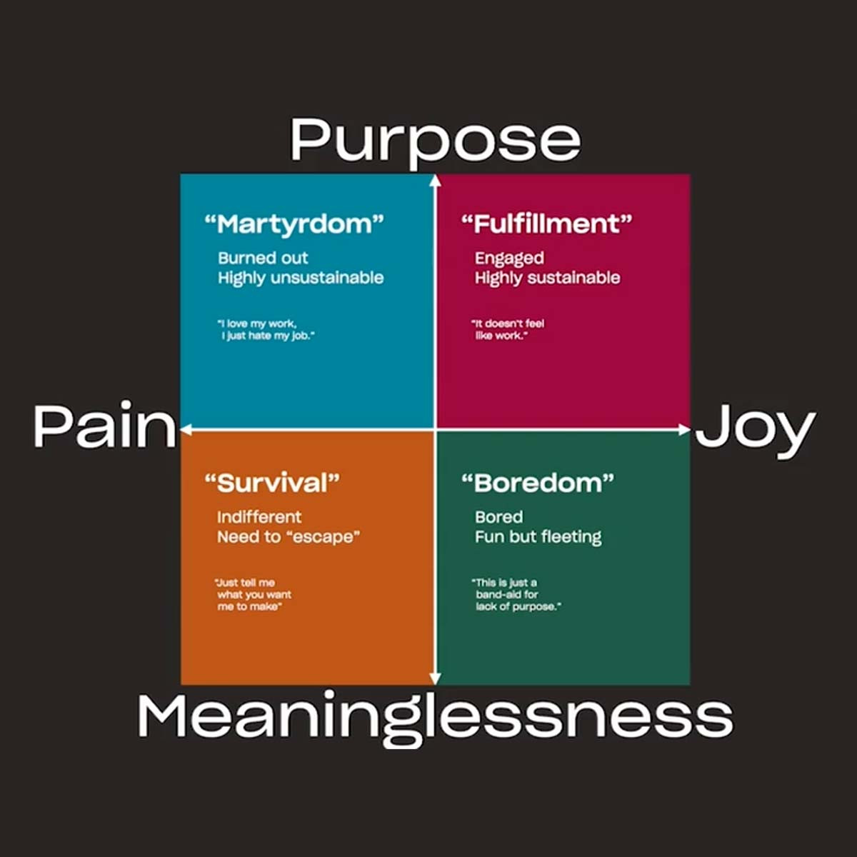
The title of this segment is a phrase that speaker Collin Whitehead repeated throughout his lecture and it really resonated with me. It refers to the last stop of the frustration train, where you angrily throw your hands in the air and just say to your project manager: “Just tell me what to do”. At this moment, creatives stop focusing on creating and go into execution mode. I would be lying if I said I haven't felt this way during a number of projects, especially when finding the right solution to a specific campaign problem becomes more the job of a wizard than a designer. Avoiding this really comes down to the way that feedback is delivered.
Frustrating feedback, according to Whitehead, can have the following characteristics: it can be late, vague, unsolicited or contradictory. Out of these four, I find late and vague feedback to be the most common to run into, while contradictory feedback would be the most irritating and not that more uncommon. Appeasing clients can be hard, but I think it’s also important to set some middle ground and be proactive in the pre production process. To be more specific, foresee fixed dates for feedback in the planned timetable, it should be about a specific part or element of the video, not just a “make it pop” comment and it should also fit within the established and approved concept. This way you can avoid future frustrations.
They have also shared some useful tools for this very purpose. Dropbox Replay, for example, is a video reviewing and feedback platform for both creators and clients. It’s not free, but an alternative could be Vimeo. Overall, I think the most important takeaway would be to move from a “survival” to a “fulfillment” state, as illustrated in the graph below. Try to identify what’s keeping you wanting to just get over with it and return to loving what you do.
Designing for scale in XD
DPDK is a Dutch digital agency with offices in Rotterdam, NY and San Francisco. Their Chief Creative Officer Michael Vromans revealed us how they keep their brand and design consistent using Adobe software. As introduction he gave 4 reasons why design systems are so important nowadays
Having a strong brand identity means that the rules have to be super clear and consistent to last through time. Mostly since branding materials are being more and more dematerialized.
It keeps getting harder for us all as consumers to differentiate one brand from another. Best practices on, for example, user flows get published and copied and implemented globally and instantly.
Design teams work more scattered than ever due to globalization and pandemic situation. Therefore working in a cloud make the situation easier.
A single brand might have a main website, multiple landing pages, an app, print assets, social channels… All channels might be managed by different agencies or people.
No need to say that all those reasons call for safeguarding creative assets to enable us to design unique, high-quality, and consistent design throughout all of those channels and products.There is a misconception about what design systems look like. Most of us might think there is a single file holding all creative or branding assets, but the fact is that every touchpoint (website, print, social, landing page, …) might have different design system. And they’ll need somehow to be related together. The common problem is that multiple agencies may work for the same brand but in separate silos. And same problem in a company, the IT department and the Marketing department often work totally disconnected from each other.
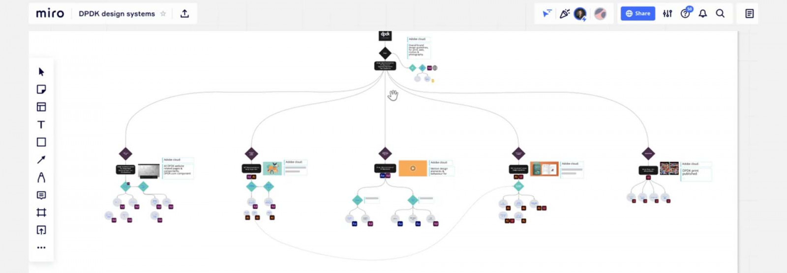
At DPDK they think the design systems not as “islands” but as “family tree”. It can branch out, it can grow and has its hierarchy. On top of the family tree are the brand guidelines, tone of voice, and all brand assets. All the children (website, landing pages, internal and external print communications) are directly connected to it.
Each touchpoint has its 3 pillars:
- component library (lego blocks)
- guidelines (how to use the blocks)
- production files (the outcome)
Having all these documentations and assets is pointless if it’s not centralized and if it’s not regularly reviewed. It’s also very important to be able to share those easily as a brand. This is why using a cloud is a thing.
So what to retain from the whole speech?
- Build a consistent and scalable design system
- Keep it alive and review it regularly
- Make it easy to share (PLZ no more PDF!!!)
Why the Best Product Shots Are Often Made in 3D
The starting point of this is always to digitize the products and when you have them digitized, you can automatically start delivering content from it. And that means any type of content could be images. Could be videos, could be interactive solutions with the ultimate goal of making every product that's out there payable. Because before getting a product into your hands after you bought it, it basically only lives on digital channels nowadays. But the 3D profession is just that starting point. Technology wasn't there yet. Garments need equity simulation tools and fabrics need high-quality material visualization techniques to bring products alive. But why go digital?
Every brand is putting effort into rapidly reducing their carbon footprint, which is often the key driver for implementing digital.
The digitalization to media sales is continuously shifting to online. Brands need to innovate quickly, iteratively and stay competitive in these emerging spaces. That means meeting consumer expectations on getting relevant parts out faster than your competition.
Consumers are expecting seamless digital brand experience to products everywhere, at any time, on every platform.
3D visuals can start to replace photography, which is then allowing reduction in time. And more importantly, it gives the foundation to create endless content and experiences from, to serve that growing consumer group.
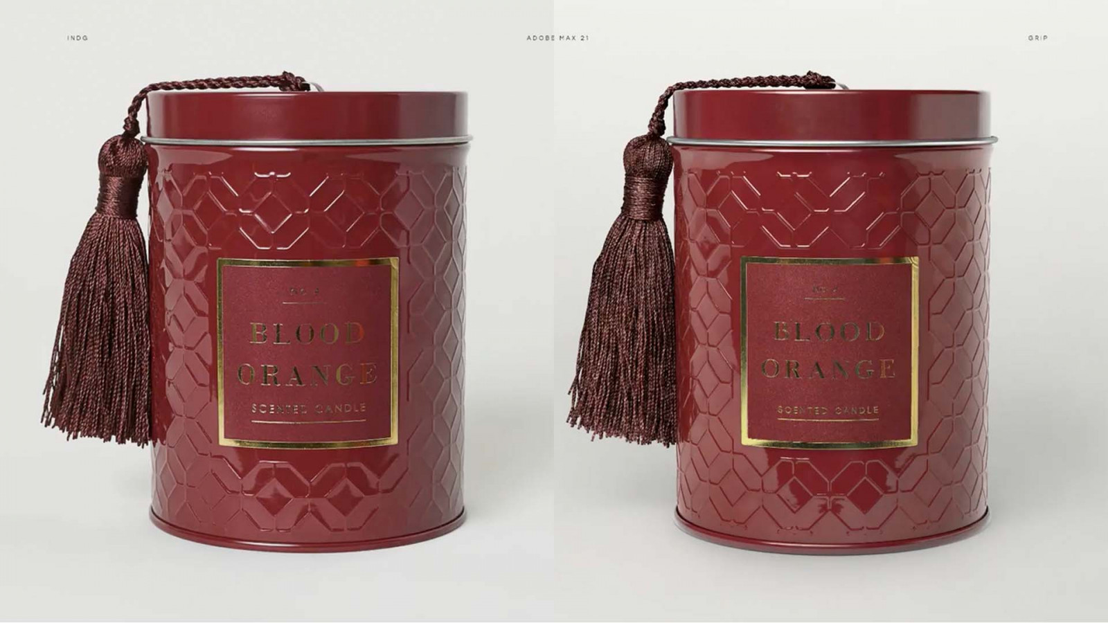
The myth of 3D just not beating the same quality as photography is pretty much busted by now. We are now able to put technology behind it so that we can get that level of quality out at high speed and efficiency. The level of quality, details and imperfections are so photoreal that consumers cannot tell the difference. Let’s see if you can spot the difference. In the photo above, which one is a real photo and which one is 3D?
So with 3D you can generate the exact piece of content at the right moment for one specific customer or audience. From which the user can then continue customizing their products to their likings. And then allowing creative content such as iterations, visuals, videos with interactive content to be simply generated. P.S.: The left photo is real and the right photo is 3D. ;)
The evolution of fonts
The session started with “Why are type trends a thing? And why would you use them”. Since my knowledge of type trends isn’t that big I was curious about how this session was about to evolve and let me spoil it for you, I thought it was really interesting.
The session was given by Sarah Hyndman, an expert in all types of fonts. She explained the history of fonts and showed how the fonts of today are developed. She started with the trend of the sans serif font. This trend was created by the shiny new apps like Google, Spotify, Airbnb, … But now these aren’t new anymore and we have to bring something extra to the font. We have to consider the context of the font. What cultural values does it reflect, what’s important to the brand, the font can’t be something it is not. “A font can set the mood”. The instinct reactions of people to the font can show what the mood of the shapes of the letters is.
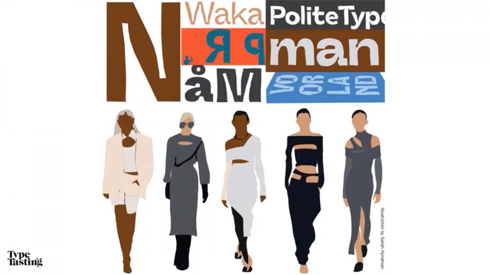
Something that really caught my attention was how fashion and fonts can collide. Recently there is this cut-out trend in fashion. You could see it all around, on TikTok, Fashion shows, … And guess what? The typefaces and fashion shared the same silhouette. The trend of Ink trap types was created. Ink traps are little gaps in the corners of the letters, just like the cut-outs in the world of fashion. This type of font isn’t new, it was something that was used for print, because in really small prints (like phonebooks) the ink would fill in the gaps, but today it is a new type trend.
All together Sarah concluded that today's fonts are moving and flexible with a lot of variety in fonts. But we have to show strength, truth and reality with the shapes of the letters. It is more important to bring your values to your font and to make it more human.
The Importance of Authenticity in Visual Media
One of the sessions I watched during this year’s Adobe MAX conference was on the importance of authenticity in visual media. The title is a bit of a catch all statement, because what the session really focused on is the growth in demand for more diverse, inclusive imagery by consumers. One of the reasons I picked this session is because, as a designer, I sometimes have to challenge clients into choosing more diverse and inclusive imagery for their visuals.
The host of the session was Brenda Milis, principal of consumer and creative insights for Adobe Stock at Adobe, who described her job as “identifying which visuals are growing in commercial appeal”. The teams at Adobe Stock want to help creatives remain “visually fluent” by researching which types of images viewers find interesting and by sharing these trends.
In recent years the demand for authentic and diverse representation became louder, especially with the rise of the Black Lives movement after the continuing police violence against black people and the violent acts of hate crimes against the Asian Pacific Island Communities in the US. Even though most of our clients are based in Belgium and Europe, I still think we all felt this shift towards more authenticity and inclusivity.
When the team at Adobe Stock talks about authentic images they mean genuine imagery. Visuals that represent everyday live, everyday people in a world that is diverse, nuanced and intersectional.
During this session Brenda focussed on values that are important for four minority groups in American society (Disabled consumers, Asian Pacific Islander (API) consumers, Black American consumers and Latinx / Hispanic consumers). Even though these are very diverse groups they also had a lot of values in common:
- Inclusivity
- Empowerment
- Connection
- Community
Brands also need to realise that consumers aren’t just part of one group. A person’s identity is way more nuanced. You can both be black and disabled, or both be API and LGBTQ+. If we want to create realistic and nuanced representations of the world around us, it’s important to address identity as an intersection of age, gender, sexual orientation, culture, ethnicity, heritage and community. So in order to create brand content that is invested in the real world we need to show images with these different nuances represented.
The most engaging commercial campaigns are those who represent a real variety of people and identities having everyday experiences across age, ethnicity, identity, body type & abilities.
At the end of her session Brenda also shared some things for brands or creatives to keep in mind when they’re planning a shoot that aims to represent members of a specific community or a group of communities.
- Make sure to have community members in front of and behind the camera during a shoot. This helps present authentic depictions of the community you are representing. It will also help you show cultural awareness and respect.
- Display shared values and diversity of opinion (see the values mentioned above)
- Represent a range of people, identities and experiences by showing diversity of age, gender, sexual orientation, religion, beliefs and range of abilities.
- By using an empowering and emotive tone you interest and connect to viewers by being relevant to their experiences.
What’s New in Photoshop
I’m a gadget lover so if one of my favourite apps has a huge update I feel like a kid in a toy store. It’s not the most original case of Adobe Max but a practical one.
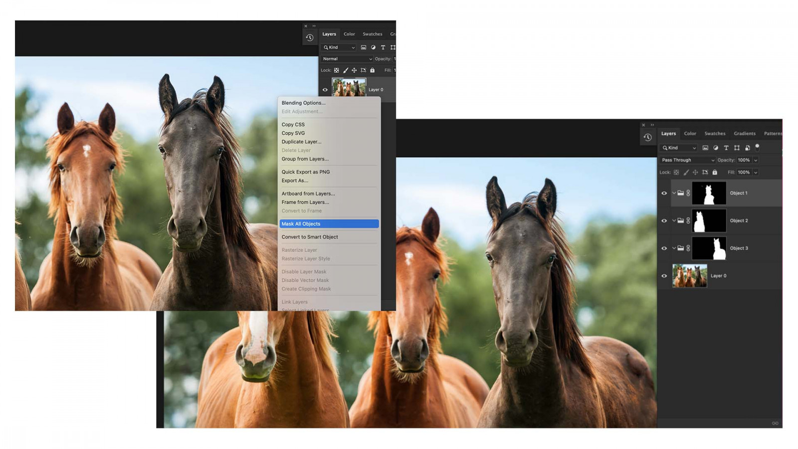
The Photoshop team made extra efforts to improve the selection and masking process, particular for the function: Tool Object Selection. The goal was to make selections easier, more accurate and more intuitive. A new option in the function is: Object finder that will look in the scene and select all the objects in that scene. You even got a preview of what these selections are gonna look like. It took only seconds to select the wanted objects and add an effect to it. Another big improvement within this function is on layer: Mask all objects. It shows everything that is selectable within the picture. If you click on layer: Mask all objects, Photoshop will make a separate masked layer for each object in a seconds. This is a huge time saver!
Finally: Better communication between Illustrator and Photoshop. You can now paste your Illustrator layers into Photoshop with all the layer information with the new option: layers. That will contain ALL your layer information like names, the organisation, all the vector content in full fidelity, shapes stay shapes… This is a huge improvement for the interoperability between Illustrator and Photoshop. It was about time!
Neural filters also got a nice update. Neural filters are based on A.I. and machine learning.
You can mix different types of landscapes. Change your summer scene to an autumn scene or even a white winter landscape. Combine different pictures with other landscape pictures. Change your landscape into a desert… It looks like a really fun tool. But I think it’s important to be careful with it. It still needs a lot of learning to always give top results.
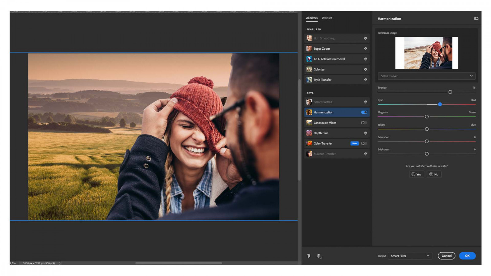
Combine two pictures and harmonize them together to give them a more natural feel within seconds. Works well and you can still tweak it a bit. This is a beta version but looks promising.
You can use colors and references from other pictures to your picture. You can choose from the library or upload your own image.
Also new in Photoshop is ‘Comment’s. Looks a lot like Comments in Google Slides. You can place a comment to the client, designer, colleague… I don’t think we will use it immediately but it’s handy if you need some help or want to have a second opinion on your design.
There are also some updates for Photoshop on the iPad. I never used it before but after seeing the demo’s I definitely will try it out.